Logo Planning
These are the planning/thumbnail sketches for my logo. Out of all of my ideas I decided to use the Ice Cube Logo design I came up with because I felt it was very aesthetically pleasing and simple. The symbols I use represent me by expressing my likes and dislikes and how I am a solid and constrict person but I can open up to people at will, the wreaths represent my competitiveness and a little fact that my name means "people victory" in Greek. The logo contains my name, a melting ice cube, the symbol for ice, and two olive wreath pieces on the sides.
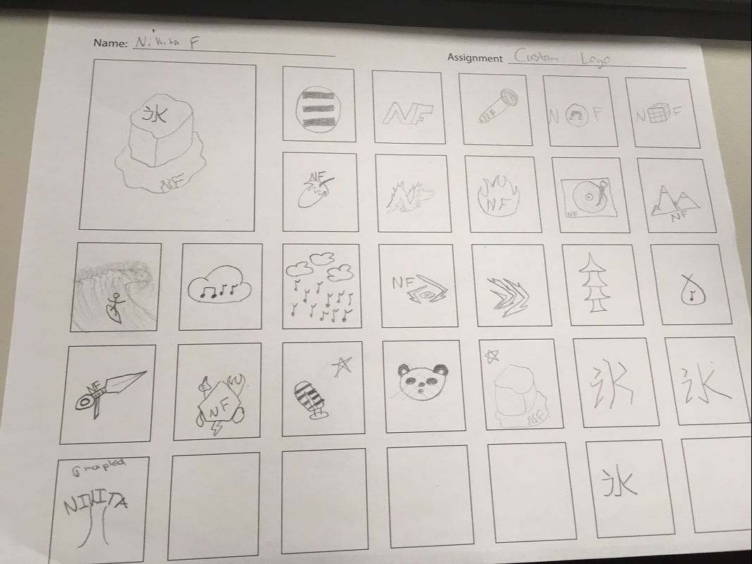
Planning Page
My logo
Final Logo
My main logo represents a lot about me. I have used the following principles of design for the creation of this logo: Harmony and rhythm. The harmony that is represented can be found withing the font of the letters and the olive wreath I have attached to the ice cube. This leaves of the wreath have an aesthetic appeal to them that flows and balances the design on both sides of the logo. The repetition of curved shapes in the logo create a flow that moves the viewers eyes all around the logo. The melting ice shapes a path that brings you to look at each component of the logo from the ice cube to the wreaths to my own name. I have also used symbolism to express interests, my personality and other looks into my life. The wreaths represent victory, my name in Greek meaning "people's victory", this represents my competitiveness and want to succeed. The melting ice cube represents my personality in general. I am usually a solid and closed person but I can tell you more about myself like interests and hobbies if someone asks. The symbol in the middle is the Japanese katakana letter for "ice". The reason my name is in a weird font is simply representing my general flexibility in situations, if I can't do something the way I want and there are other solutions I am generally a flexible person.
Other Logos
Panda Logo
|
Name logo
|
